Use Figure.NZ
How to use Figure.NZ and engage our services.
Return to the Figure.NZ website.
Everything on Tohu is free to use under CC-BY license
Using Figure.NZ
Figure.NZ exists to make it easier for all New Zealanders to find and use figures about our country. Learn more about us by reading our story.
If you’re not sure what you might use figures for, or why, here are some ideas.
- To learn more about where you live, whether that’s Whangarei, Invercargill, or somewhere in between.
- To find out about a topic, like health, education, or our population.
- For work presentations and reports, or school projects — the right figures can go a long way to helping you make your point.
Have a look at our case studies to see how other people use Figure.NZ, and read our guide to getting started with charts if you’d like some pointers.
All the data on figure.nz is free for you to use, but you do need to stick to the license terms of the original data provider — you can find these linked below each chart and table on our site. You also need to follow our own reasonable terms and conditions, which are linked in our website footer.
You can find more detailed information on using our charts in our brand guidelines.
Getting started with charts
Charts are much easier to understand than tables full of numbers, but they can still be tricky to get your head around. Here are some basics to get you started.
What’s a chart?
A chart, or graph, is a graphic representation of data. The data is illustrated by visual aids like lines, bars, or slices. There are several kinds of chart, which are used to show data in different ways.
Some chart types you’ve probably seen before are:
- Line charts, which show changes over time.
- Bar or column charts, which compare different values.
- Pie charts, which show proportions of a whole. At this stage, Figure.NZ doesn’t make pie charts, but we may do in future.
Why make charts?
You might wonder why people make charts, when we could just look at the numbers themselves. Our brains all work differently, but many people find it easier to interpret data in a visual form.
Compare this:
With this:
Though these show the same data, they look very different, and the visual form is much easier to understand at a glance.
What makes up a chart?
Charts typically have a few features which help us understand them.
Note: you may come across charts elsewhere that don’t have all the elements described below, but we include them in every Figure.NZ chart.
Title
The title tells you what the chart is about. It may also give some context, like whether the data is for a specific country.
Subtitle
The subtitle (just below the title in Figure.NZ charts) tells you how the data is being displayed. It may include a time frame or date, category type, or unit of measurement.
In Figure.NZ charts, we also include the label for the vertical axis in the subtitle.
Provider
The provider info (just below the subtitle in Figure.NZ charts) tells you where the data has come from. Here at Figure.NZ we don’t collect data ourselves — read our blog post about how we source and process data to learn more about this.
Vertical axis
The vertical axis (also called the Y-axis) shows you the measurement scale of the chart. It often goes up in increments of a value described in the subtitle.
On Figure.NZ charts, the Y-axis starts at 0 — except when there are negative values, like in this chart about migration and population increase in New Zealand.
Horizontal axis
The horizontal axis (also called the X-axis) shows you what’s being charted. This could be years, age groups, or some other category type.
Axis labels
Each axis also has labels that say what each axis represents — that could be anything from numbers of people to age groups.
As mentioned above, in Figure.NZ charts, we say what the units for the vertical axis are in the subtitle, instead of along the axis itself. This makes it easier to read on small screens, like your mobile phone.
Key
The key tells you what’s represented by different colours or line types on a chart. Sometimes it’s called a “legend”.
How to read a chart
Most charts on figure.nz have a feature which lets you see the figures anywhere on a chart by either hovering over or tapping the part you’re interested in. We still want you to know how to read charts elsewhere, though — so, onwards!
Start by locating the information you want
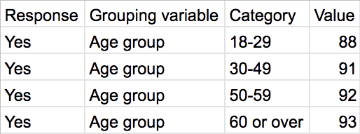
For example, when looking at a time series (a chart which shows changes over time), like this one about Miniature Schnauzers, you might want to know what was happening in the year 2014.
- First, find that year on the horizontal axis.
- Guide your eyes up to where the data is sitting in that year.
- When you’ve found the data point, make a level line back to the vertical axis to see the value of that data point — in this case, about 5,500 Miniature Schnauzers.
Check the axis scale
Once you know the value, it’s important to double-check the scale of the axis. Sometimes it could be in hundreds, thousands, millions, or even billions.
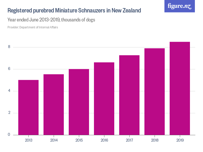
You can double-check this in the subtitle or on the vertical axis label. For example, in the subtitle of the chart below about public transport patronage in Greater Wellington, you can see that the values shown are in “millions of boardings”.
Sometimes data is displayed in values which aren’t easy to understand, like percentiles. The OECD Glossary of Statistical Terms is a handy resource for jargon-busting help.
If something still seems odd or you’re not sure you understand what you’re looking at, then it’s time to check the metadata.
Metadata
Metadata is information that describes things about the data. It summarises information about the data which makes reading and working with it much easier.
Under each Figure.NZ chart (like this one about sheep numbers), you’ll find a metadata section (called “About this data”) which has more information about the data displayed in the chart.
It may include the following.
- An outline of any changes or calculations we’ve made to the original data.
- A link to the original source.
- Details about how the data was collected.
- The purpose of the data.
- Helpful definitions.
- Explicit inclusions or exclusions which have been made. A good example is this chart about Kiwisaver, where the metadata (as well as the subtitle) notes that “Members with no income are excluded.”
Connecting the dots
Once you know what you’re looking at, there are a few questions you can ask to help you make sense of it.
- What’s this chart about?
- What does the data show?
- How does this compare with other data?
- What could be happening in the real world to create these figures?
- Who could this be relevant for, and why?
Let’s work through those questions with an example.
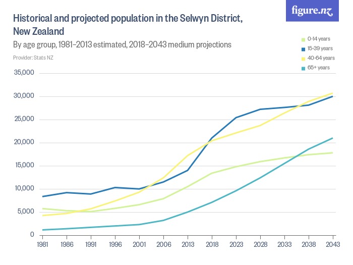
1. What’s this chart about?
The title tells us it’s about historical and projected population for the Selwyn District in New Zealand.
2. What does the data show?
It shows that numbers of people across all age groups have increased steadily since 1981, and are projected to increase significantly into the future.
3. How does this compare with other data?
You could see how the same figures compare for a different part of New Zealand — for example, the neighbouring Ashburton District — or browse other data about the Selwyn District.
4. What could be happening in the real world to create these figures?
Some factors could be changes in life expectancy, birth rate, deaths, and migration.
5. Who could this be relevant for, and why?
To start with, understanding this data could be useful for people running maternity wards, or funeral homes. It could also come in handy for infrastructure planning or resource allocation, as it gives a broad sense of the services our future population might need as it changes in size and age breakdown.
Case studies
Student: Rangimārie
Rangimārie lives in Auckland. She’s a student at Kowhai Intermediate and is a descendent of Ngāti Whātua and Ngāpuhi.
She doesn’t often use numbers in her thinking at school at the moment, but she can see how Figure.NZ could help, commenting “It’s useful because you could be trying to find out something for an exam and find the answer. It’s not cheating, it’s research”.

She also thinks Figure.NZ could be useful for promoting New Zealand and for tourists who are coming to visit our whenua, observing “People who are coming to Aotearoa could use it to learn about us”.
She thinks it would make a big difference to our future if we didn’t have access to data. Rangimārie commented “It’s really good research and data, and it means you can know things that are interesting instead of just guessing. It’ll help your knowledge and mean you can get better at things”.
University student: Tim Leyland
Massey University student Tim Leyland says Figure.NZ is a go-to resource when it comes to doing assignments, as well as simply browsing for information. “It’s got a really inviting design and the charts and maps are well labelled, so it’s easy for people who might be a bit shy of data to understand and use.”

The Nelson resident describes the website as a great reference tool and often visits when he has a specific enquiry in mind. “I had a number of assignments where I needed to provide historical context on how things had changed, what the trends looked like, or what the geographic distribution might look like. Figure.NZ was one of my go-to sites,” he says.
Tim, who is studying data analytics, is particularly keen on the quality of Figure.NZ’s metadata (data that gives information about other data), specifically, how it helps him easily make citations in assignments. “The sources are well referenced, and it’s easy to trace back and make sure you’re looking at the right data, and check how current the information is.”
As well as using the site for assignments, Tim also likes to follow his nose and dive into the 40,000 charts, maps and tables that make up the website.
“There’s so much information, and it’s fun to just poke around. Sometimes, later, when a question does come up in conversation I’ll remember seeing something relevant on Figure.NZ. People sometimes get stuck in a rut of asking Google for everything they need to know, and if they don’t find the answer on the first few hits they give up. But there’s a lot of information that it only takes a little more enquiry to find, and Figure.NZ is a great example to show people.”
Tim has a philosophical view on the power of numbers to inform decisions, and is 100% on board with Figure.NZ’s mission to help New Zealanders see clearly through the use of numbers.
“I absolutely agree with the vision of putting data and information into the hands of everyone,” he says. “Just about every decision and choice we make in life has to be made with less than perfect information. If we’re lucky, we have our own experience and knowledge to draw on, and maybe the advice of people we trust, but that’s not always going to be sufficient in every case. If we don’t want to always just guess our way through life, then we need good data to help us make good choices.”
Image courtesy of Alyson Baker. All rights reserved.
English teacher: Anna Dowling
Working at Victoria University of Wellington’s English Language Institute, Anna Dowling teaches English as a second language to students from all over the world. Much of her work involves helping students improve their language skills before they go on to undergraduate or postgraduate study.

As part of their coursework, students write essays describing and interpreting charts. Anna explains: “For this we like to use recent, authentic charts, often about New Zealand — which is what Figure.NZ specialises in.”With such a wide range of data (nearly 40,000 charts), there’s something for everyone on Figure.NZ — as Anna says, “it’s possible to find a chart on almost any topic”.
She uses these charts in class, showing them to her students to spark discussion about what they show, and why the data might have changed over time. “Figure.NZ has been really useful because there are so many topics, and a lot of charts showing data from recent years, or comparing recent years to mid-20th century, for example.” Anna likes being able to explore the site through simple searches from the home page. She usually starts by searching for topics that might suit — for example, “children” or “tourists”. Once she’s seen the range of data available, she narrows down further by topic or time period.
The metadata (data that gives information about other data) that accompanies every chart has also come in handy, showing Anna background information and other links to follow if she wants to learn more.
Anna recommends Figure.NZ for anyone who’s interested in learning more about New Zealand, saying: “The website is easy to navigate and use, and the charts are well-presented.”
Image courtesy of Colin McDiarmid, Victoria University of Wellington.
Parent: Billy Miller

Billy is the father of a 17-year-old.
“My daughter was completing a stats assessment the other evening and I walked into the study to find her using Figure.NZ for trends on construction costs and property sales. You should be so proud about creating something that touches so many people, especially the youngsters.”
Use our data
We process data from many disparate formats and turn it into standardised machine-readable form. We publish all data in multiple formats, so you can use what works best for you.
If something doesn’t make sense please email us at data@figure.nz so we can make it clearer or fix any mistakes 😱.
Types of content
Charts
We have tens of thousands of charts for you to use. We make as many charts as we can from each dataset, because most people find charts easier to use and understand than raw data. All our charts are presented in a consistent form and follow our standards, including all relevant metadata (information that describes things about the data).
You can use our charts in your own work or share them with others using the tools built in to our website.
Tables
All the data we process and standardise is available in downloadable CSV tables — a file format used to store data, like a spreadsheet. We also publish metadata to accompany tables. Here’s a table about New Zealand’s estimated and projected age distribution by territorial authority 1981-2043.
Because there are so many tables on figure.nz, our website doesn’t display them by default, but you can see them by searching for a topic and then selecting the Tables tab at the top of the search results.
API
It’s important for us to make data we’ve processed available in the most useful and accessible ways possible. One way we’re considering for more technical users is a public API. If you’re someone who might like to use this, please get in touch using the details on our team page so we can include your needs in our thinking.
If “API” doesn’t mean anything to you, don’t worry, you’re not alone! The nutshell version is it stands for “Application Programming Interface”. An interface is where things meet. Beaches are an interface between land and sea; APIs are interfaces between different pieces of software. For a longer description you’re probably best to check out what Wikipedia says.
Metadata
Metadata is information that describes things about the data. This can include definitions of words, limitations on the data, why the data was collected, who collected it, and how to locate the original files.
Metadata is attached to every element of every piece of data we publish, down to the individual cell in every table. We publish a summary of the metadata we have on every chart, map and table page on our site.
Crediting Figure.NZ content
- Find the correct licensing details for the chart or table you’re using by clicking on the “© License” link to the below left of the title.
- This will take you to a Creative Commons licensing page, which details the license that applies to that particular content. Note: different pieces of content have different licenses, so it’s important to check this every time.
- Copy the text that appears in brackets after the full license description (called the “slug”) – this is what you need to include in your credit. The slug will be something like “CC BY 4.0”.
- If you’re using a chart, create a credit saying “Figure.NZ / [License]”, replacing [License] with the slug.
- If you’re using a table – for example, to make your own chart from the data – create a credit saying “Sourced from [Provider name] via Figure.NZ under [License]”, replacing [Provider name] with the provider info (this appears just below the table title), and [License] with the slug.
- Make the text that says “Figure.NZ” a link to the original chart on Figure.NZ, so readers can explore further if they’re interested.
- Maps cannot be re-used due to licensing issues.
Misuse of our content
Figure.NZ makes information available to all New Zealanders, without restrictions. Thousands of our charts and tables are seen every day in newspapers, forums, and on web sites other than our own. We don’t require anyone to discuss their use with us or ask our permission. Making data freely available is what we do.
Occasionally, this means you may see our charts used in some unusual places, or to justify controversial or poorly-considered points of view. While we monitor how our data is used, we don’t restrict it unless it is being used unlawfully.
We’re aware that fringe groups occasionally use our charts out of context, or to justify positions that are not always supported by the data made available by the chart. We don’t police this, and you don’t need to report these instances to us. We aim to counter misinformation by continuing to publish truthful, verified data.
Figure.NZ datasets are historical and even our latest updates may not reflect the most up-to-date information. For general information about COVID-19, visit covid19.govt.nz. For access to provisional datasets about the spread of COVID-19 in New Zealand, visit the Ministry of Health.
Updates to data
Figure.NZ publishes the most up-to-date information available. We almost always do this by replacing older versions with newer versions at the same URL, because this makes it easier to use Figure.NZ as a reference.
This also means if you link directly to a specific content on Figure.NZ in a publication or printed work, you should expect that content to be periodically updated to include new information. We put substantial effort into doing this without breaking links to the original content, but you should anticipate that the resources you link to may change over time.
On very rare occasions, we may remove content you have previously linked to, either because it has since been found to be inaccurate, or the nature of the material and its collection procedure has changed so dramatically it no longer shows the same information. In those cases, we try hard to provide links to related content as an alternative.
About our data
The data we have is defined as follows.
- Public and aggregate. To protect individual privacy, we don’t publish any personal or unit record data.
- Relevant for New Zealand. Most of our data is about New Zealand, but we do publish some public international data so we can compare New Zealand with other countries.
- Collected by others. We don’t do any primary data collection. We rely on the good work of lots of providers.
- Of varying quality. Hundreds of organisations in New Zealand collect data that’s relevant for us to use. Some of these organisations have robust and official statistical methods (like Statistics New Zealand), and others are simply collecting data from their customers, or as a by-product of the service they provide. All of our content is clearly labelled with the name of the provider, where the data came from, and the metadata included in it.
- On lots of topics. We care about all topics relevant for New Zealand. What we have is limited to what we’ve had the resources to publish so far, but we add more every day. You can see what kinds of data we have by looking at our topics or providers pages.
Data treatment
All data we publish is checked separately by two members of our data team, and we maintain a complete audit trail down to the individual cell in everything we publish.
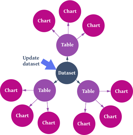
Once we’ve sourced a dataset we want to publish, we follow the process below.
Import and extract
- Check if the data file needs any modifications. This can include things like deleting duplicate data points, or combining multiple data sheets into one.
- Import the dataset file to Grace.
- Add the dataset metadata. This is the set of definitions and methodology notes (how and why the data was collected) that come from the data provider.
- Do extractions. This is us using Grace to transform the original data format into a machine-readable and human-friendly CSV file.
- If required: add to enumerations. Enumerations are standard lists of concepts or geographical areas that we use consistent words for across disparate datasets. Some examples of enumerations are country, region, industry, and occupation.
- Refine dataset metadata. We review the metadata, adding detail that makes it easier to understand.
Audit extraction and dataset metadata
- Audit the dataset metadata. We do this by getting another data officer to sense-check and proofread the metadata (including notes and definitions) that will appear with our charts and tables.
- Audit tables and add tags. This is when we make sure our standardised CSV file reflects the original data accurately. We check we haven’t missed any data points by mistake, and that the units are correct (for example, NZD, %, hectares, etc). We add tags so people can find the tables easily through the figure.nz search or by browsing suggested topics.
- Publish tables. This is when we’re confident enough in the data to make it available for everyone to see!
- If required: add Linked Enumeration Values (LEV). LEVs are a kind of metadata we can attach to our tables, to show that the information in the table is somewhat related to a concept. For example, this what we use to tell our website that marriage and funeral data may be of interest to florists.
Make charts
Audit
- Audit charts. We do this by getting another data officer to check that the charts are showing the information accurately, that the title is clear, and that the chart type we’ve used (like bar, column, or line) is the most appropriate option.
- Publish charts. This is when the charts become searchable on figure.nz 🎉
- If required: delete any old content. If a new chart is a better source of information for data we already had, we may get rid of the old content.
We’re still only human 🤔, so if you spot anything we should check, please send us an email at data@figure.nz.
Our process is designed to preserve as much metadata as possible, both to allow future calculations based on the data, and also because it’s hard to know in advance which metadata will be significant to people.
All of our data publishing is supported by the software we’ve designed and built for this purpose. If you’re interested in what happens behind the scenes, you can read about our technology stack in our frequently asked questions section.
Finding data
We’re continuously working to make it easier for you to find the content you need 🕵🏾.
Getting good search results from large volumes of relatively similar data is a hard problem, and we’re still working on that. If you’re struggling to find something, we’d like to know. If we don’t have it yet, we can probably tell you where to find it, or it could be that our search is letting you down.
Either way, send us an email at data@figure.nz or contact us on Twitter or Facebook and we’ll do our best to help.
Publish your data
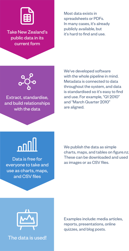
We’ve developed the software, processes and team required to take data in different formats and turn it into standardised machine-readable form, before publishing it in a variety of consistent formats that make it easy for everyone to use.
We provide commercial data publishing services to those that want to make their data public and easy to use. All the data we process is free for everyone to use and take from figure.nz.
Being a charity is critical to what we’re doing, because it means we don’t have competing priorities. We’re here to advance New Zealand and we have a very clear purpose around that.
Here’s what our system looks like.
Services we provide
You can engage us in the following ways.
- To publish specific datasets. These can be your own, or others’, if we’re allowed to use them. You can use us as your external-facing channel for getting your data open and getting it used. Examples of those using us this way include the Treasury, Department of Internal Affairs, and the NZ Defence Force.
- To publish data on a topic. Want to see a range of data on a specific topic published? We can look at public domestic and international providers to publish data for you. Examples of those using us this way include Department of Prime Minister and Cabinet, Auckland Tourism, Events and Economic Development Agency, and InternetNZ.
- To create charts and maps. If you want particular charts and maps that aren’t already on figure.nz, we can make these for you. This may be for a report, blog, online stories, presentations or pitches, especially when you need the added benefit of having our trusted and neutral third party branding. We’ll do our best to make what’s useful for you, but we won’t compromise our standards.
Why use our services
Organisations engage us instead of publishing their own data for the following reasons.
- We make it easy to find. If people can’t find your data, they can’t use it.
- We make it easy to understand. Data that’s presented in lots of different styles is too hard for people to use. We put the data you care about into consistent and usable formats.
- We support your data. Our social media engagement and promotional campaigns are fully backed by an expert team who can answer questions about your data and how to use it.
- You can benefit from our work to promote data use throughout New Zealand: our media relationships, our private-sector partnerships, our public promotional work, and our own front-end tools.
- No security risk. We work only from the data you provide to us, so your internal systems are never exposed. This also removes the cost and complexity of another large IT project, and our auditing process catches any remaining errors.
- We make it fast, cheap and great. Most organisations aren’t experts at making data usable, because they’re focused on delivering their core products and services, not data science.
Best of all, you don’t need to change anything internally to use Figure.NZ’s services. We don’t need access to your internal systems — simply give us a copy of the data, even if it’s in Excel spreadsheets, and we’ll handle the rest.
You’ll not only have your data published, it’ll also be standardised with metadata, compliant with New Zealand’s national standards, and easier for your team to use internally. Our expert data officers can also give you feedback on anything that might help you to improve your data practices.
Fast, cheap and great
Publishing your data is important, but it’s likely your team have other priorities. We know most organisations with data are data providers by accident — they collect data as a by-product of other services, and are unlikely to have in-house data publishing skills. We make it easy and safe for you to publish your data.
All you need to do is give us your data as-is — it can be in Excel spreadsheets, or CSVs, or even a PDF report. We’ll take care of the rest. Sometimes it’s easiest for organisations to start with data that’s already technically public but is hard to find and use — this way there are fewer hurdles to making it open and it’s easier to get comfortable with how we work.
We’ve created a custom software platform, Grace, which is designed to efficiently and accurately take your data from its current formats and turn it into beautiful machine-readable tables. This saves you hours of processing time.
Charts and maps can be easily updated when new data is released. They don’t need to be recreated — we simply add the new data and all the published data updates automatically.
Even better, the processed data can be reused anywhere. You can take the charts and maps we make and share them internally to help your team see patterns and gain insights, which in turn can help with making better decisions. You can save time when you receive Official Information Act requests — simply link the requester to the freely available data you’ve already published on Figure.NZ. You can even proactively promote your available data to cut down the requests coming in the door.
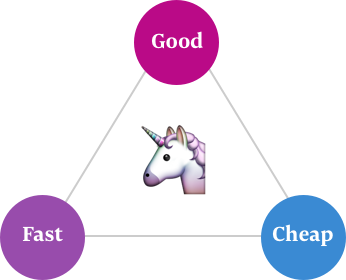
It sounds like there should be a catch. We know when you’re asked to choose from fast, cheap, and good, you can usually only pick two, but we’re a unicorn 🦄. As a charity, we can offer you excellent value, excellent quality and world-leading technical services.
Our approach works
Data published on figure.nz is usable and it gets used.
As part of our data processing we create tables, charts and maps that are specially designed to be both user-friendly and accessible to all New Zealanders. Our data officers can create hundreds of charts in a single day. As part of this process, we create plain-language definitions for the terms your organisation uses, enabling everyday New Zealanders to really understand the data you collect.
Your content is published to our web site and can be shared via social media and with our media partners like Stuff. We’re constantly exploring new ways to get New Zealanders engaged in data, from quizzes and radio segments, to videos and talks.
Some examples of the data we’ve published being used:
- Stuff
- RNZ
- Newsroom
- The Wireless
- The Spinoff
- Te Punaha Matatini innovation blog series
- AI Forum: Shaping a Future New Zealand report
Internal benefits
Publishing your data has benefits for the people in your organisation, as well as the public.
We know that teams who can understand the problems they’re trying to solve through data make better decisions, but it’s hard to do that when you can’t find or make sense of your own figures.
Publishing your data with Figure.NZ brings together the data scattered throughout your organisation, making it much easier for your teams to find. The data is also published in easy-to-understand forms like charts and maps, making it more user-friendly for your less confident data users, encouraging them to use numbers in their thinking. It’s also published in machine-readable, downloadable CSV files, so your more advanced users can quickly dig into it to do deeper analysis without needing to spend time cleaning it up.
Figure.NZ also makes it easier to understand the information. We publish metadata that explains data providers and jargon alongside every chart, map and table on our site, and we’re developing data literacy material designed to help build confidence and competence in data use.
Future-proof
We live in an unpredictable world and it’s vital that information doesn’t get locked into a single system. We can help you future-proof your data, taking it from random bespoke formats and turning it into something that’s easily portable and reusable. Everything we process is transformed into machine-readable form, and is completely available for you to easily take, use, feed back into internal systems, and archive at any time.
What our services cost
We’ve done data publishing projects that range in cost from $1,000 to $100,000.
Cost is driven by how long it takes our team to process your data, which in turn depends more on the state of your datasets than their size — large datasets that are already in a simple CSV file are often faster to process than small ad-hoc spreadsheets. However, we can process all types of dataset. As a very rough indication, a $1,000 project produced about 40 charts, and a $100,000 project produced about 6,000 charts.
Updating datasets when new data is released is faster and cheaper than the initial processing. Our sophisticated internal tools keep track of the changes, and if your data format hasn’t changed since the previous version, a full update will only cost about 15% of the initial processing cost.
It’s hard to predict the price without first spending time looking through a dataset to see what form it takes. Often customers will engage us by setting a maximum project fee and then trust us to process as much as we can, giving regular updates so they feel comfortable. Working this way allows us to publish the most data for the least money, serving both your publishing goals and our charitable mission.
How to engage us
Get in touch with Baruch ter Wal to chat about engaging our services at any time by sending an email to baruch.terwal@figure.nz or calling +64 21 388 420.
We understand that making the decision to publish your data is often best done with others involved, and we’re happy to come and talk with your team about what we can do.